Your brand identity says a lot about your company. It can tell people your name. It can help to convey your company’s values. It can even illustrate the tone of your company – is your company classic and traditional? Is your company modern? Does your company have a playful sense of humor?

Whether it's your web pages, blog posts, social media, white papers, infographics, or enewsletter, your marketing efforts must be aligned to your brand foundation. It's easy to lose sight of your brand foundation and start making inconsistent decisions when it comes to marketing. But having a disjointed brand eventually hurts your company as prospects get confused with who you are and what you do.
What is a Visual Brand Identity?
Brand identity is the visual representation of your company's brand that distinguishes it from competitors. It encompasses your company's logo, color scheme, imagery, and shapes. Creating a cohesive brand identity is essential for building recognition, trust, and credibility with your audience.
Your logo should reflect your brand, while your color palette should complement it. Consistency in imagery and icons across all your marketing efforts is also crucial. By incorporating shapes that echo your logo, you can create texture and patterns that enhance the overall look of your branding.
Building a strong brand identity requires careful attention to detail but can pay off in the long run by establishing your brand and resonating with buyers.
Visual Branding Makes You Memorable
It’s a common belief that you have only seven seconds to make a first impression, so that impression must be memorable. The easiest way to make a quick impact for your business is through your visual branding. A visual brand that will be memorable for your audience should include:
- Logo
- Color palette with primary and secondary colors
- Font scheme
- Icon set
- Graphic style
- Imagery
These visual elements should convey who you are and what you do.

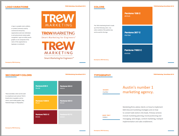
This sample of TREW Marketing’s style guide includes logo use, colors, and fonts.
Visual Branding Makes You Trustworthy
An important part of marketing is building trust with your audience. People are more likely to trust a company with a well-designed, consistent brand than one that is poorly designed or inconsistent. One way to build trust is by creating consistency through visual branding.
To create consistency, establish your visual brand beyond your logo to include specific colors, fonts, shapes, icons, and imagery, and use these elements throughout all of your marketing content, so that each piece looks like it’s part of the same family. You should use them so consistently throughout your content that audiences are able to predict with near certainty what a new piece of content will look like before they even open it. When prospects see your content on other outlets, visual branding helps them immediately associate the content with your company.

Would you be inclined to purchase from a company with this sign?
A great tool that you can use to help establish visual brand consistency is a style guide. A style guide is a formal document that identifies all fonts, colors, and other visual elements to be used in your visual branding. You can give this to your team members and contractors who need to know this information, such as designers or web developers. (Bonus: you can also use a style guide to establish consistency in your writing style.) Creating templates that have your visual branding built in will make it easier for less design savvy team members to stay on brand.
Visual Branding Makes Your Content Easy to Consume
Through visual branding, you can create content that is both visually appealing and easy to consume. As we mentioned above, templates are a great tool for reinforcing your visual brand consistently. They can also be useful for making your content easier for your audience to consume. Create different styles of headings in your templates with visual variations like font color, font weight and size, or an altogether different font. Use these heading styles across content pieces to create a hierarchy within each piece.
Another design principle that helps make your content easy to consume is appropriate use of white space. White space is the empty space and gaps between written content and graphics or images. You can use white space to help guide your audience’s focus to the most important item on a page.

Vertech’s white paper uses a large margin of white space to highlight callout quotes or details.
Through appropriate visual branding, design, and formatting, you can generate a user-friendly experience that is intuitive. An intuitive visual experience shows that you understand your audience, their priorities, and their pain points, which helps to reinforce trust in your company.
4 Elements of a Cohesive Brand Identity
Logo
Your corporate logo is the face of your company and should have a primary role in your marketing, sales and company content. Your logo should reflect your brand and resonate with your buyers. If you have product logos, those should also be included on product collateral and web content.


Here is an example of Wineman Technology's company logo and one of their product logos.
Brand Color Palette
A brand color palette not only looks good, it also ties your brand together. Start by picking a main brand color and then select complementary colors to accent it. Here's an example of strong color palette:

Here's an example of a brand color palette.
Imagery & Icons
From the images and icons on your website to social media posts, your brand should be reflected and consistent in all your marketing imagery. If you decide to go with icons to showcase your company's services, then use your brand colors in these icons and consistently use the selected icons across web pages and product data sheets. Some brands stick to stock photos, others take their own photos. More recently, brands have started using graphics and illustrations in place of images. It doesn't matter which route you pick, just stick to a cohesive imagery.
![]()
Hallam ICS uses these icons throughout it's website to depict its five service offerings.
Shapes
It can be very effective to include a brand shape from a graphic identity to create program elements. Shapes that echo the logo (squares for a squareish logo, circles for a circular logo, etc.) can be used to create pattern or texture. These elements not only are useful in making the look of your design more cohesive, but they also can help make the graphic identity more meaningful and memorable to your audience.

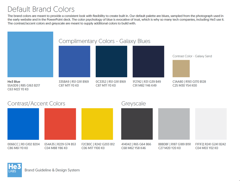
He3Labs uses squares in their branding efforts to go along with their square shaped logo.
Want to learn how you can build a foundation for your brand identity? Download our guide, Smart Messaging for Engineers, to learn how develop brand position and messaging that resonates with buyers and establishes your brand.
TREW is a marketing agency dedicated to reaching engineering and technical audiences through a range of marketing initiatives. Contact us today to learn more about the services we offer.
SUBSCRIBE TO OUR BLOG FOR THE LATEST UPDATES
Julia Holliday
 Julia joined the TREW Crew with a unique client perspective. As a former client, she worked with TREW to guide her employer through a brand evolution combining two 50-year-old brands. She has a passion for both brand marketing and content marketing, with extensive experience collaborating with engineers and subject matter experts in creating and translating technical material into content easily understood by technical audiences.
About TREW Marketing
TREW Marketing is a strategy-first content marketing agency serving B2B companies that target highly technical buyers. With deep experience in the design, embedded, measurement and automation, and software industries, TREW Marketing provides branding, marketing strategy, content development, and digital marketing services to help customers efficiently and effectively achieve business goals.


 Julia Holliday
